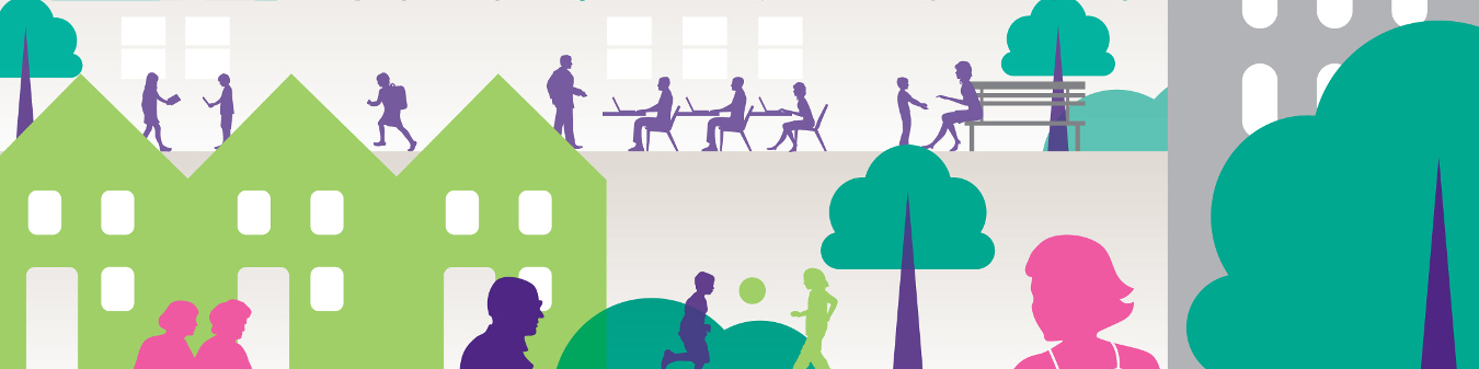
Civica Town Styles
You can change and view the global styles for civica town here
Changing the values below will create overrides in less files under css/client
For more information about less see the Less CSS preprocessor documentation
Please note: For best functionality open this page in Chrome - or anything other than I.E. The file and colour pickers may not work otherwise.Contents
- Global
- Page header
- Page footer
- Planning pages
- My account pages
- Licensing pages
- Council Tax Widget
- Find Address Widget
- My Service Request Widget
- Refuse Collection Dates Widget
- Key Object Viewer Widget
- MyProperty and MyNeighbourhood Widgets
- Full Text Search Widget
- Styling Files
- Elements - All
- Header Element
- Footer Element
- Form Elements
- Body Elements
- Links
- Quotes
- Tables and List
- Page Layout
- Font Awesome Icons
- Qtips
- Datepicker
- Address Picker
- Accordions
- Alerts
- Breadcrumbs
- Civica Menu
- Help
- Search
- Advanced Search
- Busy Indicator
- Keyobject Viewer
- Document Viewer
- Document List
- Open Layers
- My Property Styling
- Home Page Styling
- Login Page Styling
- MyAccounts Page Styling
- Planning Page Styling
- Licensing Page Styling
- List Styling
Global
Global colours
Images
For the logo use an image with the same height as the header

Typography
Global flow
Control the spacing round certain elements.
The civica-content class can be used to denote seperate sections of content, for example some instructions, or a button group.
The content class will have the default spacing applied to the base.
Page Header
Page footer
Responsive breakpoints
- Phones < @breakpoint-small
- Small device tables >= breakpoint small
- Medium device desktops >= breakpoint medium
- Large device desktops >= breakpoint large
Planning
For best results use an image with a ratio of 4:1 (width:height)
E.g. 1380px by 345px
My Accounts
For best results use an image with a ratio of 4:1 (width:height)
E.g. 1380px by 345px

Licencing
For best results use an image with a ratio of 4:1 (width:height)
E.g. 1380px by 345px


Booking
For best results use an image with a ratio of 4:1 (width:height)
E.g. 1380px by 345px
Blue Badges
For best results use an image with a ratio of 4:1 (width:height)
E.g. 1380px by 345px

Council Tax Widget
Default styling for the Council Tax Widget. This widget displays generic band/charge data only.
Band
DCurrent Council Tax Annual Charge (£)
£175Find Address Widget
Default styling for the Find Address Widget. This widget searches for addresses based on the supplied search criteria, allows for the selection from anm address list and provides the ability to add new address.
My Service Request List Widget
Default styling for the My Service Request List Widget. TThis widget displays a list of Service Requests (processes) associated with the current authenticated user.
Refuse Collection Dates Widget
Default styling for the Refuse Collection Dates Widget. The widget displays the different refuse collection dates associated with the logged in user.
Normal collection day
WednesdayNext black bin collection
03-02-2016Next green recycling collection
10-02-2016Normal garden waste collection day
TuesdayNext garden waste collection
02-02-2016Key Object Viewer Widget
Default styling for the Key Object Viewer Widget. This widget displays KeyObject (Case) Information.
MyProperty and MyNeighbourhood Widget
Default styling for the both these widgets. The MyProperty widget displays the property and map information of the logged in user. The MyNeighbourhood Widget displays information regarding conservation areas, listed buildings, etc.
Full Text Widget
Default styling for the Free Text Widget. This is how the free text field for searching can be rendered.
List Styling
Default styling for Lists. In this section we specify the styling we have created for lists.
Thumbnail List - This is a list with an image of the left and text on the right of the image. Please note the border has been added here placeholder purposes
General Elements
CSS File:element.all.less
General element placeholder
Body Elements
CSS File:element.body.less
This file contains the element styles for html and body. Here the font family, colour,font size and margins styles are specified.
Header Element
CSS File: element.header.less
This file contains the styling for the header element.
 Menu
MenuElement - Footer
CSS File:element.footer.less
This file contains the styles used for the footer element
Form Elements
CSS File:element.form.less
This file contains the styles for form elements - e.g input, textarea, select, button. These should only be overridden if there is a great need for it.
Select Box
Multi-Select Box
Displays four rows
Input Field
Buttons
All button styling should be consistent. Use a[role="button"], input[type="submit"], input[type="button"], button, .btn
Textarea Field
Radio Button
Labels
Heading Elements
CSS File:element.headings.less
This file contains the element styles for headings e.g h1, h2. It defines the size, weight and font. H1 and H2 should not be used within the widgets. These elements should be handled by the page content management system. So H2 should be used to introduce the widget on the page and then H3, H4 can be used within the widgets.
H1
H2
H3
H4
H5
Elements - Links
CSS File:element.links.less
This file contains the element styles for html links. Links should all be consistent therefore should use the styling defined here.
Elements - quotes
CSS File:element.quotes.less
This file contains the element styles for quotes and citations
Aren’t all these quotes the same?
No. First of all: quote ≠ block quote ≠ pull quote.
Sven Lennartz, Block Quotes and Pull Quotes: Examples and Good Practices
Elements - Emphasized
CSS File:element.emphasized.less
This file contains the element styles for emphasized elements
Elements - Tables and List
CSS File:element.tables-and-lists.less
This file contains the element styles for tables and list.
List
- List 1
- List 2
Table
| Col 1 | Col 2 |
|---|---|
| Some | Notes |
Object - Page Layout
CSS File:object.page-layouts.less
This file gives a bunch of classes to use for responsive layouts
Layouts tend to be grouped into the following sizes
Phones less than 768px @breakpoint-phone
Small device tablets greater than or equal to 768px @breakpoint-small
Medium device desktops greater than or equal to 992px @breakpoint-medium
Large device desktops greater than or equal 1200px @breakpoint-large
Font Awesome Icons
CSS File:component.fontawesome.less
This file contains styling associated with font awesome icons used within the Civica widgets.
Qtip
CSS File:component.qtip.less
This file contains the styling for the qtips. These are used mostly in forms to identify mandatory fields.
Datepicker
CSS File:component.datepicker.less
The styling here relates to the date picker used on forms. The position should be absolute and not like in the example below.
Address Picker
CSS File: component.addresspicker.less
This file describes the styling used for the address picker. The widget displays the number of matches, the list of address and an option to add a new address.
Accordions
CSS File: component.accordian.less
This file describes the styling for the civica accordions.
Accodions are used when large amounts of content needs to be displayed but there is a limited space on the screen.
Alerts
CSS File: component.alerts.less
These are the styles used for alerts. These alerts can be warning, errors and successful outcomes.
- Password and Password Confirm must match
- Email Address and Email Address Confirm must match
Breadcrumbs
CSS File: component.breadcrumb.less
Describes styling used for the breadcrumbs.
Civica Menu
CSS File:component.civica-menu.less
The styling here relates to the "In this Section" (right side) Menu
For Example
Help
CSS File:component.help.less
This file contains the styles for the help functionality (for instance on callscripts). It requires the qtip styling to be included first.
Advanced Search
CSS File:component.keyobject-advanced-search.less
This file contains the styles for the advance keyobject search functionality
All available keyobject search fields are displayed as default. If a search field needs to be hidden, it can be done by following the steps belows:
- From the advance search page, right click on the label of the field and select "Inspect" in Chome or "Inspect Element" in IE.
- This will open up the developer tools. In the elements tab you will see the label highlighed. Above the label you will see a div with class 'civicaQuestion'. Two divs above this is a div that has two class names. One of the class name is "civica-input" and the other class name is unique to the search field.
- At this div level a style can be added to hide the search fields (e.g. display:none;) using the unique class name e.g. civicakeyobjectsearch-appplancase-appealref.
Busy indicator
CSS File:component.busy-indicator.less
This file contains the styling associated with the busy icon.
Civica Form
CSS File:component.civica-form.less
This is extra specific styling for civica forms. The file holds styling overrides. For example the date field length - it has a class of hasDatepicker.
KeyObject Viewer
CSS File: component-civica-keyobject-viewer.less
This file contains styling associated with the keyobject viewer.
Document Viewer
CSS File:component.document-viewer.less
This file contains the style associated with the document viewer.
Document List
CSS File:component.document-list.less
The styling here relates to the document list widget. Different icons are used to represent different doc types.
- Council Tax Bill1 November 2013
Open Layers
CSS File:component.openlayers.less
This file contains the styles used for OpenLayers (rendering the maps).
My Property
CSS File:component.myproperty.less
This file contains styling for the MyNeighbourhood widget and MyProperty widget.
For Example - MyNeighbourhood Widget
 in a conservation areaa listed buildingcovered by a tree preservation orderin a designated area of natural beauty
Search
CSS File:component.search.less
This file contains the styles for the search functionality.
Planning Page
CSS File: theme.planning.less
This file contains the styling for the Planning page.
Taxi Licence
CSS File: theme.taxi-licence.less
This file contains the styling for the taxi licence page.
MyAccount Page
CSS File: theme.myaccounts.less
This file contains the styling for the My Accounts page.
Home Page Styling
CSS File: theme.home.less
This file contains the styling for the home page.
Login Page
CSS File: theme.login.less
This file contains the styling needed for the login page.
Booking Page
CSS File: theme.booking.less
This file contains the styling for the Booking page.
Blue Badges Page
CSS File: theme.bluebadges.less
This file contains the styling for the Blue Badges page.
Responsive
CSS File: trumps.responsive.less
These styles are overrides for responsive functionality.
Authentication State
CSS File:trumps.authentication-state.less
You can use these styles to show / hide according to the logged in contacts authentication status.
They are set in the masterpage after the authentication widget has run.